Creating a react-bootstrap Typescript Library
Posted Tuesday, January 5, 2021.
I had a lot of requirements for this project, and it took a great deal of trial and error to get all of them working in tandem. Here is how I did it.
Create new NPM project and Typescript config
mkdir component-kit
cd component-kit
npm init -y
tsc --init
Add dependencies
I prefer yarn but feel free to add dependencies with npm (or edit package.json directly)
Peer Dependencies:
yarn add -P \
  react \
  react-dom \
  react-bootstrap
Dev Dependencies:
yarn add -D \
  @babel/core \
  @babel/preset-env \
  @rollup/plugin-commonjs \
  @rollup/plugin-node-resolve \
  @storybook/addon-actions \
  @storybook/addon-essentials \
  @storybook/addon-links \
  @storybook/addon-postcss \
  @storybook/addons \
  @storybook/builder-webpack5 \
  @storybook/manager-webpack5 \
  @storybook/node-logger \
  @storybook/react \
  @storybook/theming \
  @testing-library/jest-dom \
  @testing-library/react \
  @types/jest \
  @types/react \
  @types/react-dom \
  @typescript-eslint/eslint-plugin \
  @typescript-eslint/parser \
  autoprefixer \
  babel-loader \
  css-loader \
  eslint \
  eslint-config-prettier \
  eslint-plugin-prettier \
  eslint-plugin-react \
  fork-ts-checker-webpack-plugin \
  node-sass \
  postcss \
  postcss-flexbugs-fixes \
  prettier \
  react \
  react-docgen-typescript \
  react-dom \
  rollup \
  rollup-plugin-peer-deps-external \
  rollup-plugin-postcss \
  rollup-plugin-typescript2 \
  sass-loader \
  style-loader \
  tslib \
  typescript \
  webpack
Folder Setup
We will make a library with a single component TestComponent. Create a folder structure to look like this:
.
├── .storybook
│   ├── main.js
│   ├── theme.js (optional)
│   ├── manager.js (optional)
│   └── preview.js
├── dist/
├── src
│   ├── TestComponent
│   │   ├── index.ts
│   │   ├── TestComponent.md
│   │   ├── TestComponent.scss
│   │   ├── TestComponent.tsx
│   │   └── TestComponent.types.ts
│   ├── index.scss
│   └── index.ts
├── .gitignore
├── .eslintrc
├── .prettierrc
├── .gitignore
├── package.json
├── README.md
├── rollup.config.js
└── tsconfig.json
Adjust package.json to look like this (adjusting personal details):
{
  "name": "@hiimtmac/component-kit",
  "version": "1.0.0",
  "description": "Component Library",
  "author": "hiimtmac",
  "main": "dist/index.js",
  "module": "dist/index.es.js",
  "types": "dist/index.d.ts",
  "files": [
    "dist"
  ],
  "scripts": {
    "build": "rm -rf ./dist/* && rollup -c",
    "yalc": "yalc push",
    "test": "jest",
    "test:watch": "jest --watch",
    "storybook": "start-storybook -p 6006",
    "storybook:export": "build-storybook"
  },
  "dependencies": {
      ...
  },
  "peerDependencies": {
      ...
  },
  "devDependencies": {
      ...
  }
}
Adjust tsconfig.json to look like this:
{
  "compilerOptions": {
    /* Basic Options */
    "target": "es5",
    "module": "esnext",
    "lib": ["es6", "dom", "es2016", "es2017"],
    "jsx": "react",
    "declaration": true,
    "declarationDir": "dist",
    "sourceMap": true,
    "rootDir": "src",

    /* Strict Type-Checking Options */
    "strict": true,
    "noImplicitAny": true,
    "strictNullChecks": true,
    "strictFunctionTypes": true,
    "strictBindCallApply": true,
    "strictPropertyInitialization": true,
    "noImplicitThis": true,
    "alwaysStrict": true,

    /* Additional Checks */
    "noUnusedLocals": true,
    "noUnusedParameters": true,
    "noImplicitReturns": true,
    "noFallthroughCasesInSwitch": true,

    /* Module Resolution Options */
    "moduleResolution": "node",
    "esModuleInterop": true,

    /* Advanced Options */
    "forceConsistentCasingInFileNames": true
  },
  "include": ["src/**/*"],
  "exclude": [
    "node_modules",
    "dist",
    "storybook-static",
    "src/**/*.stories.tsx",
    "src/**/*.test.tsx"
  ]
}
Adjust rollup.config.js to look like this:
import peerDepsExternal from "rollup-plugin-peer-deps-external";
import resolve from "@rollup/plugin-node-resolve";
import commonjs from "@rollup/plugin-commonjs";
import typescript from "rollup-plugin-typescript2";
import postcss from "rollup-plugin-postcss";
import autoprefixer from "autoprefixer";
import path from "path";
import packageJson from "./package.json";

export default {
  input: "./src/index.ts",
  output: [
    {
      file: packageJson.main,
      format: "cjs",
      sourcemap: true,
    },
    {
      file: packageJson.module,
      format: "esm",
      sourcemap: true,
    },
  ],
  plugins: [
    peerDepsExternal(),
    resolve(),
    commonjs(),
    typescript(),
    postcss({
      extract: true,
      sourceMap: true,
      extensions: [".scss", ".css"],
      namedExports: true,
      plugins: [autoprefixer],
      minimize: true,
      use: [
        [
          "sass",
          {
            includePaths: [path.resolve("node_modules")],
          },
        ],
      ],
    }),
  ],
};
Peer dependencies caused me a lot of trouble using webpack (specifically when using react-bootstrap and it gave me a lot of errors about multiple copies of react when I would import my library). Make sure to be careful what is a true dependency vs what should be a peer dependency.
Create your component(s)
We will make a very simple component that wraps the react-boostrap loader, either showing a spinner with optional text if prop variable is in loading state, or the content if prop variable is not in loading state (image below shows loading state).

First will be the TestComponent.types.ts file where we will declare our props.
import { ReactNode } from "react";

export type TestComponentProps = {
  isLoading: boolean;
  message?: string;
  children?: ReactNode;
};
Then we will declare the component in TestComponent.tsx.
import React from "react";
import { Spinner } from "react-bootstrap";
import { TestComponentProps } from "./TestComponent.types";
import "./TestComponent.scss";

export const TestComponent = (prop: TestComponentProps) => {
  const Loader = () => {
    return (
      <div style={{ textAlign: "center" }}>
        <Spinner animation="border" role="status">
          <span className="sr-only">Loading...</span>
        </Spinner>
        {!!prop.message && <p>{prop.message}</p>}
      </div>
    );
  };

  if (prop.isLoading) {
    return <Loader />;
  } else {
    return <React.Fragment>{prop.children}</React.Fragment>;
  }
};
Adjust any stylings in TestComponent.scss.
We will be using Storybook JS to preview our components (setup in later section). Adjust TestComponent.stories.tsx.
import React from "react";
import { TestComponent } from "./TestComponent";

export default {
  title: "TestComponent",
};

export const Primary = () => <TestComponent isLoading={true} message="We are loading" />;
export const Secondary = () => (
  <TestComponent isLoading={false}>
    <p>Done loading!</p>
  </TestComponent>
);
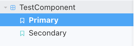
This will declare two separate previews for this component which you can select on the storybook nav like so:

Index Setups
Setup proper imports in index.ts files:
/src/TestComponent/index.ts should include an export for our component:
export { TestComponent } from "./TestComponent";
src/index.ts should include an export for our component folder, and an import for our root index.scss file:
import "./index.scss";
export { TestComponent } from "./TestComponent";
Any global styles can go into the src/index.scss file.
This index work might seem useless but becomes more helpful when you have lots of components and dont have to do longer path resolving in your root index.ts like export { CoolButton } from "./components/buttons/cool/CoolButton"
Storybook Config
Adjust /.storybook.main.js to have the following:
const path = require("path");

module.exports = {
  stories: ["../src/**/*.stories.mdx", "../src/**/*.stories.@(js|jsx|ts|tsx)"],
  addons: ["@storybook/addon-links", "@storybook/addon-essentials", "@storybook/addon-postcss"],
  typescript: {
    check: true,
    checkOptions: {},
    reactDocgen: "react-docgen-typescript",
    reactDocgenTypescriptOptions: {
      propFilter: (prop) => ["label", "disabled"].includes(prop.name),
    },
  },
  core: {
    builder: "webpack5",
  },
  babel: async (options) => ({
    ...options,
    plugins: [
      ["@babel/plugin-proposal-class-properties", { loose: true }],
      ["@babel/plugin-proposal-private-methods", { loose: true }],
      ["@babel/plugin-proposal-private-property-in-object", { loose: true }],
    ],
  }),
  webpackFinal: async (config, { configType }) => {
    config.module.rules.push({
      test: /\.scss$/,
      use: ["style-loader", "css-loader", "sass-loader"],
      include: path.resolve(__dirname, "../src"),
    });

    return config;
  },
};
In order to have our global styles show in the previews we need to import our main sass file. Adjust /.storybook/preview.js to have the following:
import "../src/index.scss";

export const parameters = {
  actions: { argTypesRegex: "^on[A-Z].*" },
  controls: {
    matchers: {
      color: /(background|color)$/i,
      date: /Date$/,
    },
  },
};
If you want a custom theme, declare it in ./storybook/theme.js:
import { create } from "@storybook/theming";

export default create({
  base: "dark",
  brandTitle: "hiimtmac",
  brandUrl: "https://hiimtmac.com",
  brandImage: "https://assets.website-files.com/hiimtmac.png",
  colorPrimary: "hotpink",
  colorSecondary: "deepskyblue",
});
And then import it in ./storybook/manager.js:
import { addons } from "@storybook/addons";
import theme from "./theme";

addons.setConfig({
  theme: theme,
});
You can then run and preview your components by running yarn storybook. This is helpful as you don't need a test project to import the library for previewing.

If you do want to import it into a test project, I would recommend using Yalc.
Building
Finally, you can build the library for distribution with yarn build. This will output all build files in the /dist folder. From here you can publish to NPM or github.
Once you've pushed it to a repo, you can add this to your projects with yarn (or npm), just like any other dependency:
yarn add @hiimtmac/component-kit
And then use it in your app!
import React, { useState } from "react";
import { TestComponent } from "@hiimtmac/component-kit";

export const Test = () => {
  const [loading, setLoading] = useState(true);

  return <TestComponent isLoading={networking}>Loading is over!</TestComponent>;
};
In Closing
Types are life. Use Typescript. It's as close as I can find to Swift for web development. In a future post, I will detail how to adjust this project to use a private github repo as the npm repo, and how to pull from it in projects.
Tagged With:

